E-Reader
E-Notes
E-books
Audiobooks
Bundles
Accessories
Newsblog
Support
E-Reader
E-Notes
E-books
Audiobooks
Bundles
Accessories
Newsblog
Support
Hello!
Personal Area
Wishlist
Orders
Compare list
E-Reader
E-Notes
E-books
Bundles
Germany-EN
Germany-DE
PocketBook Shop - Buy eReaders, eNotes, eBooks, Audiobooks, and Accessories Online.
Choose your PocketBook
See more
E-reader
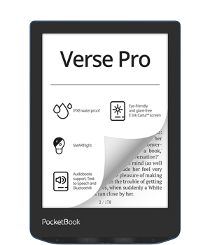
Verse Pro Color Stormy Sea
Price
0
175,00 €
E-reader
InkPad 4 Stardust Silver
Price
0
289,00 €
E-reader
Era Stardust Silver
Price
0
229,00 €
E-reader
InkPad Color 3 Stormy Sea
Price
0
329,00 €
E-reader
Era Color Stormy Sea
Price
0
239,00 €
E-reader
Verse Mist Grey
Price
0
135,00 €
E-reader
Verse Lite
Price
0
115,00 €
E-reader
Verse Bright Blue
Price
0
135,00 €
E-reader
Verse Pro Azure
Price
0
169,00 €
E-reader
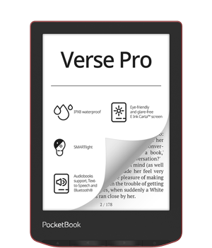
Verse Pro Passion Red
Price
0
169,00 €
E-note
Color Note Stormy Sea
Price
0
599,00 €
E-note
InkPad Eo Mist Grey
Price
0
569,00 €
E-note
PocketBook InkPad X Pro
Price
0
319,00 €
New
E-reader
Era Color: fashion edition with DKNY cover
Price
0
269,00 €
New
E-reader
Era Color: fashion edition with Karl Lagerfeld cover
Price
0
269,00 €
E-reader
PocketBook InkPad Color Moon Silver
Price
0
225,00 €
See more
Best sellers in English
See more
E-book
The Wife
Alafair Burke
Price
0
8,99 €
E-book
The Mark
Fríða Ísberg
Price
0
15,99 €
E-book
A Talent for Murder
Peter Swanson
Price
0
15,99 €
New
E-book
The Lacuna
Barbara Kingsolver
Price
0
10,99 €
E-book
The Discomfort of Evening
Lucas Rijneveld
Price
0
8,99 €
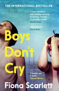
E-book
Boys Don't Cry
Fíona Scarlett
Price
0
11,99 €
E-book
The Night of Baba Yaga
Akira Otani
Price
0
11,99 €
E-book
Love After Love
Ingrid Persaud
Price
0
11,99 €
E-book
The Happiness Hypothesis
Jonathan Haidt
Price
0
9,49 €
E-book
The Martian
Andy Weir
Price
0
8,49 €
E-book
Animal Farm
George Orwell
Price
0
15,49 €
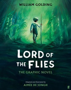
E-book
Lord of the Flies
William Golding
Price
0
19,99 €
E-book
The Frozen River
Ariel Lawhon
Price
0
9,59 €
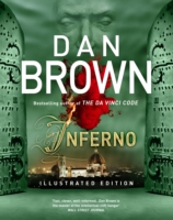
E-book
Inferno - Illustrated Edition
Dan Brown
Price
0
28,49 €
E-book
Man's Search For Meaning
Viktor E. Frankl
Price
0
6,99 €
E-book
One Night, Markovitch
Ayelet Gundar-goshen
Price
0
8,39 €
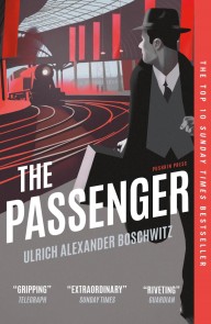
E-book
The Passenger
Ulrich Alexander Boschwitz
Price
0
8,39 €
E-book
The Pharmacist's Wife
Vanessa Tait
Price
0
6,99 €
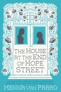
E-book
The House at the End of Hope Street
Menna Van Praag
Price
5,99 € *
Old Price
7,49 €
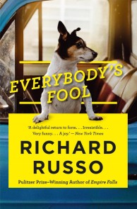
E-book
Everybody's Fool
Richard Russo
Price
9,99 € *
Old Price
10,48 €
See more
Book of the day
Father Christmas's Fake Beard
Terry Pratchett
0
0
A collection of wonderful Christmas stories from the fantastically funny Terry Pratchett. With
Price
10,99 €
Add to cart
Price
10,99 €
Add to cart
The Best Books of the 21st Century
See more
E-book
The Brief Wondrous Life of Oscar Wao
Junot Diaz
Price
0
10,99 €
E-book
Housekeeping
Marilynne Robinson
Price
0
10,99 €
E-book
Small Things Like These
Claire Keegan
Price
0
11,99 €
E-book
Line of Beauty
Alan Hollinghurst
Price
0
14,97 €
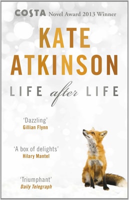
E-book
Life After Life
Kate Atkinson
Price
0
13,49 €
E-book
Fifth Season
N. K. Jemisin
Price
0
36,00 €
E-book
Outline
Rachel Cusk
Price
0
10,99 €
E-book
The Years - WINNER OF THE 2022 NOBEL PRIZE IN LITERATURE
Annie Ernaux
Price
0
7,19 €
See more
Reads for Kids
See more
E-book
The Polar Bear Explorers' Club
Alex Bell
Price
0
8,99 €
E-book
Tourmaline and the Museum of Marvels
Ruth Lauren
Price
0
9,59 €
E-book
Shadow Fox
Carlie Sorosiak
Price
0
9,59 €
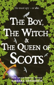
E-book
The Boy, The Witch and The Queen of Scots
Barbara Henderson
Price
0
7,19 €
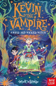
E-book
Kevin the Vampire: A Wild and Wicked Witch
Matt Brown
Price
0
9,59 €
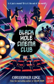
E-book
Black Hole Cinema Club
Christopher Edge
Price
0
9,59 €
E-book
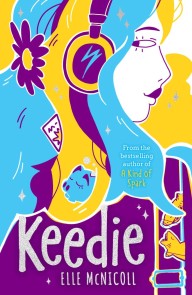
Keedie
Elle Mcnicoll
Price
0
9,59 €
E-book
Secrets of the Snakestone
Piu DasGupta
Price
0
9,59 €
E-book
Vivi Conway and The Sword of Legend
Lizzie Huxley-jones
Price
0
9,59 €
E-book
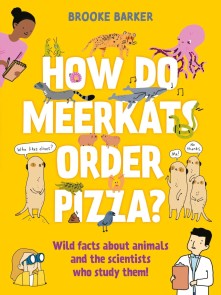
How Do Meerkats Order Pizza?
Brooke Barker
Price
0
11,99 €
E-book
Vengeance of the Pirate Queen
Tricia Levenseller
Price
9,59 € *
Old Price
11,99 €
E-book
Mermaid Academy: Amber and Flash
Linda Chapman
Price
0
8,39 €
E-book
The Hero Puppy
Holly Webb
Price
0
8,39 €
E-book
Lenny Lemmon and the Alien Invasion
Ben Davis
Price
0
9,59 €
See more
Color E-books
See more
E-book
Long Way Down (The Graphic Novel)
Jason Reynolds
Price
0
11,99 €
E-book
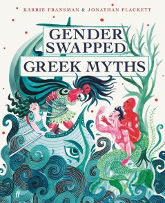
Gender Swapped Greek Myths
Jonathan Plackett
Price
0
13,99 €
E-book
Oxygen Mask: A Graphic Novel
Jason Reynolds
Price
0
10,99 €
E-book
Stand In Your Power
Rachael Smith
Price
0
11,99 €
E-book
Press Start! Super Rabbit Boy Powers Up!
Thomas Flintham
Price
0
8,39 €
E-book
Press Start! Super Rabbit Racers!
Thomas Flintham
Price
0
8,39 €
E-book
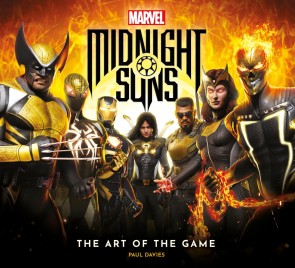
Marvel's Midnight Suns - The Art of the Game
Paul Davies
Price
0
20,99 €
E-book
Lizzy Goosie
Mitzie Duncan-vaz
Price
0
10,99 €
E-book
Puppy Problems
Paige Braddock
Price
0
9,59 €
E-book
Press Start! Super Rabbit Boy vs Super Rabbit Boss!
Thomas Flintham
Price
0
8,39 €
E-book
River Rescue
Paige Braddock
Price
0
9,59 €
E-book
Doggy School
Paige Braddock
Price
0
9,59 €
E-book
Press Start! Super Rabbit Boy Blasts Off!
Thomas Flintham
Price
0
9,59 €
E-book
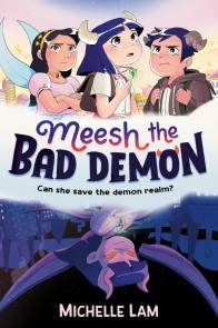
Meesh the Bad Demon
Michelle Lam
Price
0
7,99 €
E-book
Peng and Spanners
Steve Webb
Price
0
8,99 €
E-book
Press Start! Super Rabbit Boy's Mega Quest!
Thomas Flintham
Price
0
8,39 €
E-book
The Dictionary of Posh
Hugh Kellett
Price
0
14,40 €
See more
Christmas Reads
E-book
Father Christmas's Fake Beard
Terry Pratchett
Price
0
10,99 €
E-book
Christmas Sanctuary
Lauren Hawkeye
Price
0
2,99 €
E-book
Christmas and Other Horrors
Terry Dowling
Price
0
15,49 €
E-book
The Christmas Stocking and Other Stories
Katie Fforde
Price
0
10,99 €
E-book
A Christmas Feast
Katie Fforde
Price
0
8,49 €
E-book
The Christmas Quilt
Lenora Worth
Price
0
9,49 €
E-book
Christmas Days
Jeanette Winterson
Price
0
12,99 €
E-book
Christmas Wishes
Katie Flynn
Price
0
10,99 €
E-book
Christmas in Cowboy Country
Janet Dailey
Price
8,49 € *
Old Price
8,99 €
E-book
Christmas Carol Murder
Leslie Meier
Price
7,99 € *
Old Price
8,99 €
E-book
Christmas Past
Mary Burton
Price
0
6,49 €
E-book
Christmas Travel Advisory
Nicki Bennett
Price
0
3,43 €
E-book
Christmas at the Amish Bakeshop
Loree Lough
Price
0
14,99 €
E-book
Christmas Dessert Murder
Joanne Fluke
Price
0
11,99 €
E-book
Christmas Joy Ride
Melody Carlson
Price
0
12,96 €
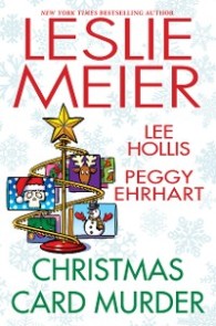
E-book
Christmas Card Murder
Peggy Ehrhart
Price
0
9,49 €
E-book
Christmas Cocoa Murder
Alex Erickson
Price
9,49 € *
Old Price
19,99 €
E-book
Christmas Candy Corpse
Rosemarie Ross
Price
8,99 € *
Old Price
9,49 €
E-book
Christmas Caramel Murder
Joanne Fluke
Price
8,99 € *
Old Price
11,99 €
E-book
Christmas Sweets
Leslie Meier
Price
0
8,99 €
E-book
Christmas in Whispering Pines
Scarlett Dunn
Price
0
8,49 €
E-book
Christmas at Cold Comfort Farm
Stella Gibbons
Price
0
8,49 €
E-book
Christmas on Cape Cod
Nan Rossiter
Price
7,99 € *
Old Price
8,99 €
E-book
Christmas with the Surplus Girls
Polly Heron
Price
3,99 € *
Old Price
4,49 €
E-book
Christmas Eve and Christmas Day
F. O. C. Darley
Price
0
2,99 €
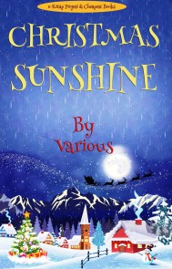
E-book
Christmas Sunshine
Various
Price
0
2,99 €
E-book
A Christmas Carol
Charles Dickens
Price
0
0,99 €
E-book
A Christmas Miracle
Robin-louise Burkitt
Price
0
10,99 €
E-book
The Christmas Collection
Scarlett Bailey
Price
0
9,99 €
E-book
Married by Christmas
Scarlett Bailey
Price
0
6,99 €
E-book
This Christmas
Liz Ireland
Price
9,49 € *
Old Price
9,99 €
E-book
A Christmas Railway Mystery
Edward Marston
Price
9,59 € *
Old Price
11,97 €
Top categories
General Fiction
Crime & Mystery
Private Investigators
Science Fiction
Fantasy
Romance
Family life fiction
Historical fiction
Kids & Teens
Comics & Manga
Cooking & Baking
Biographies